Sunday 28 February 2016

A sneak peek!! - Colour Blast Australia

A SNEAK PEEK of my project created for Colour Blast Australia Blog - 6th March 2016
 
 
Stay tuned for intense colour and toilet paper embellishments.....yes toilet paper :-)


Wild Daisies by Elisa Ablett

Hi Crafty friends,
 
 
Elisa here again sharing a layout I created for the WOW Words or Whatever Blog called - Beautiful - featuring one of my photos of beautiful native Australian daisies:

WOW Words or Whatever Products used:

Beautiful title chipboard
Bouquet Chipboard
Flourish Altamatz
Floral scroll chipboard


Here are some close ups and you can definitely see the amazing shine and shimmer of the Colour Blast Australia Products on the WOW Chipboard.
 
 
In this layout I used the flourish altamatz and Colour Blast 'apple of my eye' paste to create the start of my mixed media background. I also used the 'Bling' Colour Blast Spray to create a second colour over the paste. I embossed the centres of the flowers with bling embossing powder and filled in a few spaces with a Kaszazz Morrocan background stamp. Some of the techniques I used on the chipboard include white sharpie paint pen on the flowers and title and embossing. So versatile that chipboard!!
 
 
A hint: I delved into my old rub-on stash and pulled out a few from Cherry Arte and I used them in strategic places to fill in a few gaps, a fantastic way to use a product that perhaps has been laying around for a while..


Well thank you so much for stopping by, we love to hear from you in the comments, you can further follow me via Facebook or Instagram
 
Elisa xx

Thursday 11 February 2016

Colour Blast Flora and Fauna Home Decor Prints by Elisa Ablett

Hi , Elisa here again, this time i'm sharing with you my step by step technique tutorial that I completed recently as part of the Design Team for Colour Blast. I am so excited to show you what these amazing Australian products can do!

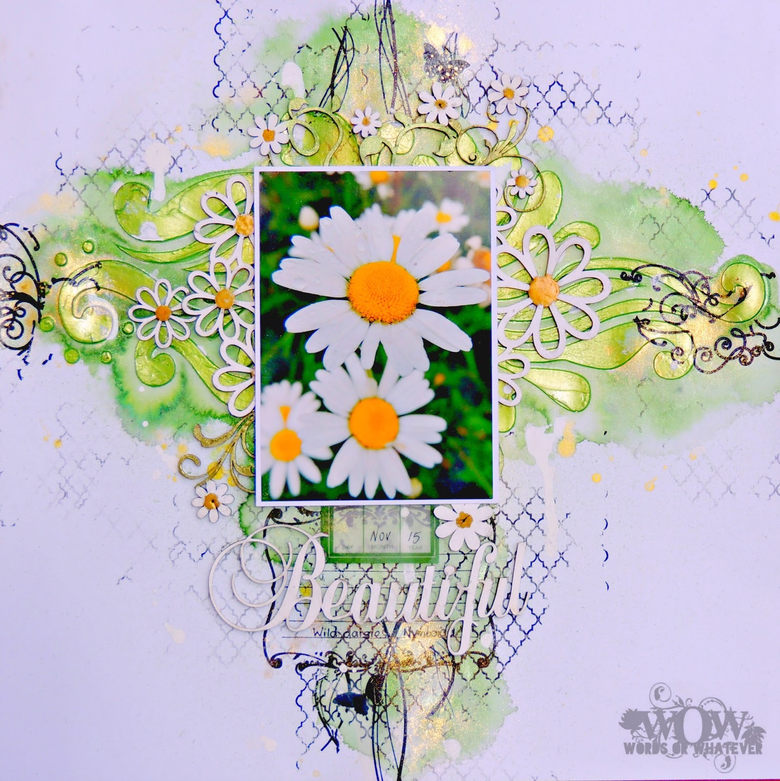
I decided to make a set of four home décor pieces using the Colour Blast Sprays, Colour Pastes and Colour Embossing Powder in a resist watercolour technique and four 7x7 frames. I used a smooth watercolour paper as my base and made use of the frame matting as well. Here is the finished product, simply so colourful and full of shimmery goodness.


Here is a close up photo of the gorgeous Colour Blast products that I used to complete the project;
 
 
and they can be found here - Colour Blast Australia Online Shop
 
I thought I would post each frame separately first and then post the techniques used underneath -


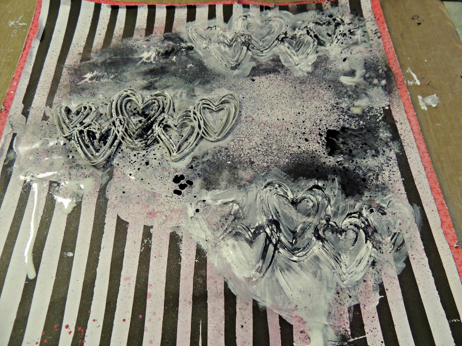
To start my project I picked four of my favourite stamps (in flora and fauna designs) and a few different stencils. I traced around the inside square of the matting (using it as a template to show the area I had to work within) on my special smooth watercolour paper, I stamped with Versamark ink and embossed with Snow White embossing powder, repeat for each frame with your favourite stamp in the theme of your choice. Warning!! the Mica from the powders can remain on your page, so I used a paint brush to clean off the areas where it shouldn't be. Also I used a static stamp pad over my paper prior to stamping to clear off dust, dirt etc. I also stamped on the mat and embossed the mat as well, as you can see from the close ups below.


I then used Snow White Colour Paste through a stencil (using a palette knife) on each mat that came with the frame. Just a few small patches on each of the frames, another way to create texture and add interest to your piece, it also is another way to create a resist technique. Dry each mat thoroughly.

 
Once dry choose the Colour Shimmer sprays you want for each frame, for the above mat I chose two of my fav colours, Envy and Deep Water, also have a spray bottle with water handy as well. Spray quite closely to your project, layering each colour by drying in between. Pay particular attention to where you applied your Colour Paste, that way you get a lovely patch of intense colour and shimmer. Use the water to disperse the colour and tilt your project to create drips and patches of colour.
 

In the photo below you see the embossed stamped image ready for the next step which is using the Shimmer Sprays as watercolours. Use a tray to separate the your colours (take the lid off each and tip a small amount in the tray or use a pipette or dropper to move your colours to the tray). To start I spray quite close to the embossed image with my water mister then I use a brush to introduce the lighter colour (Rose Petal) to the background of the flower, tapping my brush here and there to create a few splats and drips. Dry each layer thoroughly.


I then introduced the darker colour - Royalty, loading my brush with the colour and tracing around the petals of the flower with the intense colour making the colour pool around the edges of the embossing powdered image. This is your 2nd watercolour resist technique, the first was the Colour paste and spray on the mats.


 You can see the intense colour and shine in the above photo, the sprays make a great alternative to metallic watercolours and by using the resist technique you can achieve many different effects with the one product. You can use a lighter embossing powder  to achieve a subtle print like I did, you can use the same colour embossing powder as a complimentary colour or use a contrasting colour to make your image really stand out amongst your watercolours. Once dry I used a sepia toned stamp pad and a textured background stamp, covered my main image with spare paper (a mask) and stamped randomly over the edges to give more depth.
 
Here are some close ups of each project -


and here is a great chart that shows the amazing colours available, each colour has a corresponding Paste, Powder and Spray.


I hope you enjoyed the techniques that I shared with you and thank you so much for stopping by the blog, make sure you leave some love....
 
 
Elisa xx


Thursday 4 February 2016

Kraft Plus February Challenge - Going Postal - DT Reveal

 
Hi Crafty friends,
 
Elisa here again sharing my first ever Art Journal two page spread that I completed as part of the DT for Kraft Plus Challenge Blog - February Challenge.
 
Here is the amazing challenge board, Kraft base plus Lots of Postage Stamps.


and here is my Art Journal pages:


The idea for these pages came from a postcard that I saw in a shop that had a caption on it that said 'from where you would rather be' with a picture of a man surfing at a beautiful beach. I immediately thought of completing a page about me dreaming of a holiday or perhaps 'my happy place' which is in the sun at the beach surrounded by my family and my camera. I used loads of postage stamps in the background for the beach and in the sun as well as I cut up a few stamps to add depth to the pages hence you will see Santa surfing, a crab, a plane, someone swimming and the Opera House. All the stamps were handpicked by me and all feature photos of Australian places, plants or animals, all places and things I would love to see in a mammoth trip around Australia one day.
Make sure you click on the link above and head on over to the Challenge site to view the design teams amazing reveal, lots of wonderful inspiration.
 
Thanks for stopping by ....
 

Off the Rails - Grungy Romance Tutorial

Hi Everyone,

Elisa here sharing the Mixed Media tutorial that I completed for  Off the Rails Scrapbooking Blog. I thought that I would share the tutorial post here as well. I wanted to show you all a different way of using chipboard to create a mixed media background for your layouts plus share a tip of using tissue paper to add texture and dimension.

Here is the February Challenge mood board that I used as the inspiration for my layout.

 
and here is the layout I created for the February Challenge and my tutorial, I don't usually work with pinks etc having two boys but I loved the idea of creating something a little grungy yet still within the theme of the mood board 'Romance' hence all the love hearts and xoxo and the recent photo of my husband and I.


Alright its tutorial time !!

Instructions are under each photo.

Step 1 - Add Gesso to your page  (can be messy and bumpy) with a palette knife and dry well with a heat gun.

Step 2 - Once dry lay some smaller chipboard pieces (or wood veneer, or die cuts etc) onto the page and use your favourite colour sprays, spray directly over the chipboard pieces using them as a mask, it may seep under a little bit but don't worry!!


Step 3 - Keep spraying over the top of the pieces with another colour, I used black and white as well as bright pink. Doesn't have to be a fine mist can be larger spots and splats. Dry thoroughly after each spray of different colour leaving your last spray (of black in my case) still slightly wet.


 Step 4 - Once dry take the wood veneer or chipboard pieces off and place your larger chipboard piece on the page and wet your brush with gesso, paint all over the chipboard piece making sure you go over onto your page, using your piece as a mask again, the gesso will blend with the spray and create multi tones of greg, white and black once you lift off the chipboard piece after painting on it and I made sure the laden brush went through the gaps onto the page. I also used a small spray bottle filled with water and gave it a little spray here and there to make the paint a little more fluid. AND YES it gets a little messy, don't worry!!

Step 5 - As you can see from the close up above, the chipboard 'mask' has created a textured pattern as part of your background.


Step 6 - I repeated step 5 a few more times around my page, added a few more black sprays (especially some larger splats). Also at this stage I sprayed white onto the page and created drips by tilting the page.


Step 7 - The tissue paper!! I folded my tissue paper into a few layers and punched out flower shapes (to bring out the flower elements of the mood board), I separated the flowers into singles and stuck them to the page whilst the white spray was still wet, they soaked into the background quite well.


Step 8 - I stuck down my larger piece of chipboard and added more splats of colour using my bright pink and black sprays, leaving space for where my photo was to go. I just undo the lid, grab the top with the inner tube attached and just lightly tap on the tube with my finger, it creates awesome splats using the ink left in the tube.


Step 9 - Stick the smaller pieces of wood veneer back on in almost the same position as they were but not quite so that you get an almost a shadowed effect. I also added a few more elements to the page including my photo and paper layering and black thread. At this stage I also used a white pencil or you can use a white pen to trace very lightly around the tissue paper flowers just to make them stand out a little bit.


 And the above photo is the finished product. I hope you have enjoyed the tutorial. Don't forget to leave some love....

Thanks

Elisa xx


Tuesday 2 February 2016

Scrap the Boys - February Design Team Reveal

Hi Elisa here again with my first share as part of the amazing Design Team at Scrap the Boys Challenge Blog.
 
 
It's a perfect fit for me, I have two boys and they are my main inspiration when I create so I have plenty of photos and stories to scrap!!!
 
 
Now down to business as they say ...
 
 
This month over at Scrap the Boy's we have an amazing sketch by the talented Laura Whitaker for you to feel inspired by, you can flip it, turn it etc we just need to see the bones of the sketch in your creation. Make sure you head on over to the blog via the link above to check out the full DT reveal and further guidelines.


Here is the layout I created using the sketch -


I decided to keep it a little more clean and simple than what I normally do BUT incorporate texture (felt, plastic, chipboard, tissue paper, washi tape, resist paper) and some mixed media techniques including water colours, water colours on resist paper, stamping and I made my own chipboard stars by handcutting the stars and sanding them back to create a rough texture and then painting them with a metallic finish to match my page.
 
Here is a couple of close up of the stars -


Thanks for stopping by the blog today ....


'Frosty' by Elisa Ablett

  Hi Crafters, Elisa here from the design team for Ink Art Designs with the first of my 'Christmas in July' projects. For this proje...